
Some links in this article are affiliate links. If you buy through them, we may earn a commission at no extra cost to you. How this works.
Every studio apartment has the same complaint: it feels like one room. That’s because it is one room. But the feeling of “one room” isn’t caused by square footage. A 400-square-foot studio and a 400-square-foot one-bedroom can have identical floor area, and the one-bedroom will feel twice as large. The difference is sightlines.
Stand in your studio and look at the layout. Your eye can probably travel from the front door to the back wall without hitting anything solid. That single unbroken sweep is what your brain reads as “one box.” Fix the sightlines and the apartment starts reading as two spaces, even though no wall moved.
Disclosure: This post contains affiliate links. If you buy through them, we may earn a small commission at no extra cost to you. We recommend products based on published specifications, the volume of real-world reviews, and how well they fit the specific problem. We have not hands-on tested every item; where an article is based on direct use, it says so.
The Real Problem Is Sightlines, Not Space
Try the doorway test. Stand in your entry with the door closed behind you. Look straight ahead and count how many separate walls you can see at the same time. In most studios, the answer is four: the wall to your left, the wall to your right, the back wall, and the ceiling plane connecting them. Your brain takes that single view and files the whole apartment under “one room.”
Now do the same test in a one-bedroom. Stand at the entry and count. You’ll see two walls, maybe three, and a doorway. The bedroom wall blocks the rest. Your brain files that as “multiple rooms” because it can’t see the whole thing at once.
That’s the entire trick. You don’t need more square footage. You need to interrupt the sightline so the eye stops before it reaches the back wall. Every technique in this article is a way to break that single sweep into two or three shorter views. If you want a deeper look at the psychology of small spaces, our guide to making a small room feel bigger covers the perceptual side in more detail.
Here’s the practical version: pick one line in your studio, usually running from the entry toward the window or the back wall, and put something in it. Not a wall. Something low, or something translucent, or something that changes the floor. The eye will stop, register a boundary, and your brain will start counting rooms instead of counting square feet.
Technique 1: The 60% Rule
Here’s the rule: no furniture in the middle third of the room should be taller than 60% of the ceiling height. In an 8-foot apartment, that’s 57 inches. In a 9-foot apartment, 65 inches. Round down, not up.
Why 60%? Because above that line, your eye reads the object as a wall. Below it, your eye reads the object as furniture and keeps traveling over the top. The ceiling plane stays visually continuous, which means the room still reads as one volume even though the floor is now divided into two zones.
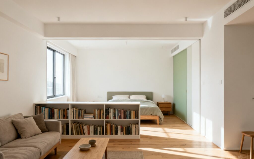
Put a 72-inch bookshelf in the middle of an 8-foot studio and you’ve built a wall. Put a 48-inch sofa back in the same spot and you’ve built a soft boundary. Same footprint, completely different effect.
How to apply it
- Measure your ceiling height. Multiply by 0.6. Write the number down.
- Identify the middle third of your floor plan. This is the strip where the sightline from your entry crosses the room.
- Any furniture in that strip needs to sit below your number. Sofa backs, console tables, low dressers, and open shelving all work. Tall bookshelves, wardrobes, and full-height storage do not.
- Push tall storage to the perimeter walls. The back wall, the wall behind the entry door, the wall next to the bathroom. Those spots don’t interrupt the sightline because the eye is already at the end of the room when it hits them.
One more thing. The 60% rule applies to the object’s height, not its width. A 60-inch-wide, 30-inch-tall console is fine in the middle of the room. A 24-inch-wide, 70-inch-tall bookcase is not. Width is your friend. Height is the enemy.
Technique 2: Zone With Floor and Light, Not With Walls
Walls are the obvious way to divide a room. They’re also the most expensive and the least reversible. In a studio, you divide with the floor and with light instead.
Rug boundaries
A rug is a floor-level wall. If it’s big enough, your brain reads the area on top of it as a distinct zone. If it’s too small, your brain reads it as a bathmat and ignores it. The minimum size for a living zone in a studio is 5×8 feet. 8×10 is better. The rug should sit under the front legs of your sofa and extend at least 12 inches past the sides.
Two rugs in a studio work better than one, provided they don’t touch. A 5×8 under the bed and a 5×8 in the living area, with 18 to 24 inches of bare floor between them, creates a visible boundary. The bare strip is what does the work. It tells the eye “different zone starts here.”
One lamp per zone
Overhead lighting flattens a studio into a single space. Turn on the ceiling fixture and every corner gets the same light, which means every corner reads as the same room. Fix this by killing the overhead light and using one lamp per zone.
Two matching floor lamps, one in the living zone and one in the sleeping zone, create two pools of light with a darker strip between them. That darker strip is your wall. It costs nothing and it works immediately. Applied to a 380-square-foot studio, the effect is strong enough that the two ends stop reading as the same space.
Texture and level changes
If you can change the floor surface, do it. A low-pile rug in the living area and a plusher one in the sleeping area signals two zones without any furniture at all. If you own the place, a 1-inch platform under the bed does the same thing more permanently. If you rent, a thick runner running along the boundary between zones works as a visual seam.
For more on layering light in a room you can’t rewire, see the no-drill lighting guide — the same adhesive and tension-rod logic applies to lamps and strips.
Technique 3: The Deliberate Sacrifice
This is the hardest one and the one that matters most. Pick one thing and give it up entirely.
Most studio dwellers try to fit everything a one-bedroom has into a single open box: sofa, bed, dining table, desk, TV, storage. The result is a room where every zone is 70% of the size it needs to be, and nothing works. Half-measures are what make studios feel cramped. The room isn’t too small; it’s too divided.
The usual sacrifice is the dining table. A four-person table needs roughly 3×5 feet of clear floor, plus 30 inches on each side for chairs to pull out. That’s a 6×8 footprint, or 48 square feet. In a 400-square-foot studio, you’ve just given away 12% of your apartment to a piece of furniture you use for 40 minutes a day.
So don’t have one. Eat at the sofa with a coffee table that lifts, or at a 12-inch-deep wall-mounted drop-leaf that folds flat when you’re not using it. Give the 48 square feet to the sleeping zone instead. Buy a proper queen bed with real storage underneath. Buy a nightstand with a drawer. The apartment will feel bigger because one zone is now correctly sized instead of two zones being starved.
How to choose what to sacrifice
- Track what you actually use for two weeks. Not what you think you use. What you actually touch.
- Whichever category gets under 30 minutes a day is your sacrifice candidate. Dining table, desk, TV console, and guest seating are the usual winners.
- Give the freed square footage to the zone that gets the most daily use. Usually the bed or the sofa.
- Solve the sacrificed function with something that folds, mounts, or disappears. A wall-mounted drop-leaf table is not a dining table. It’s a shelf that occasionally becomes one.
One caveat: don’t sacrifice storage. Storage is the one function you can’t fake. If anything, sacrifice floor space to gain more of it.
The dividers that create the boundary without a wall are compared side by side in no-drill room dividers for studios.
What to Buy
Four product types do 90% of the work in a studio layout. Everything else is decoration.
1. A low-profile rug, 5×8 or larger
Size matters more than material here. A 5×8 is the minimum for a living zone; 8×10 is better if your floor plan allows it. Look for a low pile, under half an inch, so doors clear it and the rug doesn’t read as a step. Wool or a wool-blend flatweave holds up better than polypropylene in a high-traffic studio. Budget $150 to $400 for something that will last. A good option is the Safavieh Braided Wool Rug in 8×10, which is flat enough to sit under a sofa without a lip.
2. A screen or room divider under 70 inches tall
This is the one place where a physical divider earns its space, and only if you keep it short. Anything over 70 inches starts blocking light from your windows and turns the studio into a corridor. Look for a three-panel folding screen in a translucent material: rice paper, linen, or perforated metal. Solid wood panels block too much. The Room Divider 3-Panel Folding Screen is 67 inches tall and lets light through, which is the whole point.
3. Two matching floor lamps
Matching is the operative word. Two identical lamps in two zones read as a deliberate lighting scheme. Two different lamps read as two random lamps. Look for something with a shade width of at least 14 inches and a height between 58 and 64 inches. Anything shorter than 58 inches won’t throw light far enough to define a zone. The Brightech Sky LED Floor Lamp is 63 inches and comes in pairs, which is convenient when you need two.
4. A narrow console table under 12 inches deep
This goes behind the sofa or against the back of a low bookshelf to create a visual boundary without blocking the sightline. Twelve inches deep is the maximum. Fourteen inches and it starts eating floor space you don’t have. Look for something with open legs so light passes underneath. The Nathan James Console Table is 11.8 inches deep and 30 inches tall, which keeps it well under the 60% line in an 8-foot apartment.
The fastest way to collapse the two-room illusion is clutter at eye level — the band is the whole argument in the vertical rule.
What Doesn’t Work (And Why)
Three popular studio tricks actively make the problem worse. All three work, with different costs. Skip them.
The bookshelf as room divider
This is the single most recommended studio tip and it’s wrong. A standard 72-inch bookshelf placed perpendicular to the wall blocks light from your windows, creates a narrow corridor on one side, and turns the back half of your studio into a cave. You’ve traded one open room for one cramped room and one dark room. That’s not an improvement.
If you must use a shelf as a divider, cap it at 48 inches and keep it open-backed. Or use it as a boundary marker rather than a wall, running parallel to the sightline instead of across it. But honestly, a rug and a lamp will do the same job with none of the downsides.
Taping off zones on the floor
This is recommended in design books. Don’t do it. Tape lines on a floor read as tape lines on a floor, not as walls. Your brain doesn’t process a strip of painter’s tape as an architectural boundary, and neither does anyone who visits. It looks like you’re mid-renovation. Rugs do the same job and they’re not adhesive.
Furniture that converts into two things
Murphy beds, sofa beds, folding dining tables that mount to the wall, coffee tables that rise into desks. Every one of them is worse at both jobs than two dedicated pieces would be. A sofa bed is a mediocre sofa and a bad bed. A wall-mounted folding table is a wobbly table and a shelf you can’t put anything on. The conversion mechanism eats the budget that should have gone into the mattress or the sofa frame.
There’s a deeper problem. Convertible furniture requires you to physically reconfigure your apartment twice a day. Most people do it for three weeks and then leave the bed down permanently. Now you have a bad bed and no sofa. Buy one good sofa and one good bed. If you don’t have room for both, that’s the signal to make the deliberate sacrifice from earlier, not to buy furniture that pretends to be two things.
The studio that feels like two rooms is almost never the one with the cleverest furniture. It’s the one where the sightline from the door stops at something low, the light comes from two separate pools, and one zone is generously sized because the other one was given up on purpose. That’s the whole method. Measure your ceiling, run the doorway test, and pick your sacrifice.